Setting Up Your First Microsoft Fabric Workspace

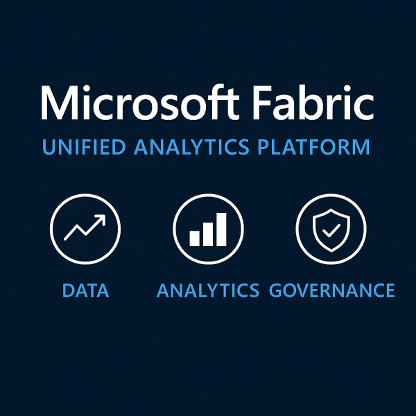
If you’re starting with Microsoft Fabric, the first thing you’ll need is a workspace, it is a central hub where all data-related assets live. Think of it as your project’s headquarters: datasets, pipelines, Lakehouses, dashboards, and governance settings are all managed here.

Why “Good Enough” Data Isn’t Good Enough Anymore

For years, organizations have operated under the assumption that “good enough” data is… good enough. A few gaps here, a few duplicates there as long as dashboards work and reports run, why sweat the small stuff? That mindset might have worked in the past. But today, “good enough” data is no longer enough and holding onto that thinking could be quietly costing your business millions.

Python for Data Engineers: 5 Scripts You Must Know

As a data engineer, your job isn’t just about moving data. It’s about doing it reliably, efficiently, and repeatably, especially when working with cloud data platforms like Azure SQL Data Warehouse (Azure Synapse Analytics). Python is one of the best tools to automate workflows, clean data, and interact with Azure SQL DW seamlessly.

Power BI DAX Hacks for Faster Reporting

If you’ve used Power BI for any amount of time, you know that DAX (Data Analysis Expressions) is both powerful and, at times, puzzling. While it unlocks deep analytical capabilities, it can also slow down your reports if not used wisely.

Storytelling with Data: Beyond the Graphs

In a world full of dashboards, reports, and visualizations, simply showing data is not enough. If you want your audience to understand, remember, and act on the insights, you need to go beyond the graph. You need to tell a story. Welcome to the world of storytelling with data, where raw numbers are transformed into compelling, clear, and meaningful narratives that spark decisions.

Secrets to Designing a High-Impact Dashboard

In today’s data-driven world, dashboards are everywhere; in executive meetings, marketing reviews, sales stand-ups, and operations war rooms. Yet despite their prevalence, most dashboards fail to deliver real value. They’re cluttered, confusing, or just ignored. A high-impact dashboard isn’t just a collection of charts. It’s a powerful decision-making tool. When designed well, it answers questions before they’re asked and guides teams to take confident, timely action.

10 Years in Data: 10 Lessons That Shaped My Career

This year marks a major milestone for me: 10 years in the data and analytics industry. Over the past decade, I’ve had the privilege to work across various domains, lead talented teams, implement large-scale cloud architectures, and help organizations transform raw data into strategic advantage.

Create a website or blog at WordPress.com

Up ↑