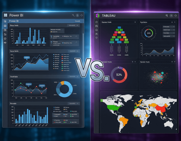
When it comes to data visualization and business intelligence (BI), Power BI and Tableau are two of the most popular platforms in the world. Both turn raw data into insights, but they differ in cost, ecosystem fit, and flexibility.
Power BI DAX Hacks for Faster Reporting
If you’ve used Power BI for any amount of time, you know that DAX (Data Analysis Expressions) is both powerful and, at times, puzzling. While it unlocks deep analytical capabilities, it can also slow down your reports if not used wisely.
Storytelling with Data: Beyond the Graphs
In a world full of dashboards, reports, and visualizations, simply showing data is not enough. If you want your audience to understand, remember, and act on the insights, you need to go beyond the graph. You need to tell a story. Welcome to the world of storytelling with data, where raw numbers are transformed into compelling, clear, and meaningful narratives that spark decisions.
Secrets to Designing a High-Impact Dashboard
In today’s data-driven world, dashboards are everywhere; in executive meetings, marketing reviews, sales stand-ups, and operations war rooms. Yet despite their prevalence, most dashboards fail to deliver real value. They’re cluttered, confusing, or just ignored. A high-impact dashboard isn’t just a collection of charts. It’s a powerful decision-making tool. When designed well, it answers questions before they’re asked and guides teams to take confident, timely action.
19 Best Practices of Power BI
Data models should be filtered and normalized. This is particularly important if datasets are sourced from high data volume repositories such as enterprise data warehouses.


